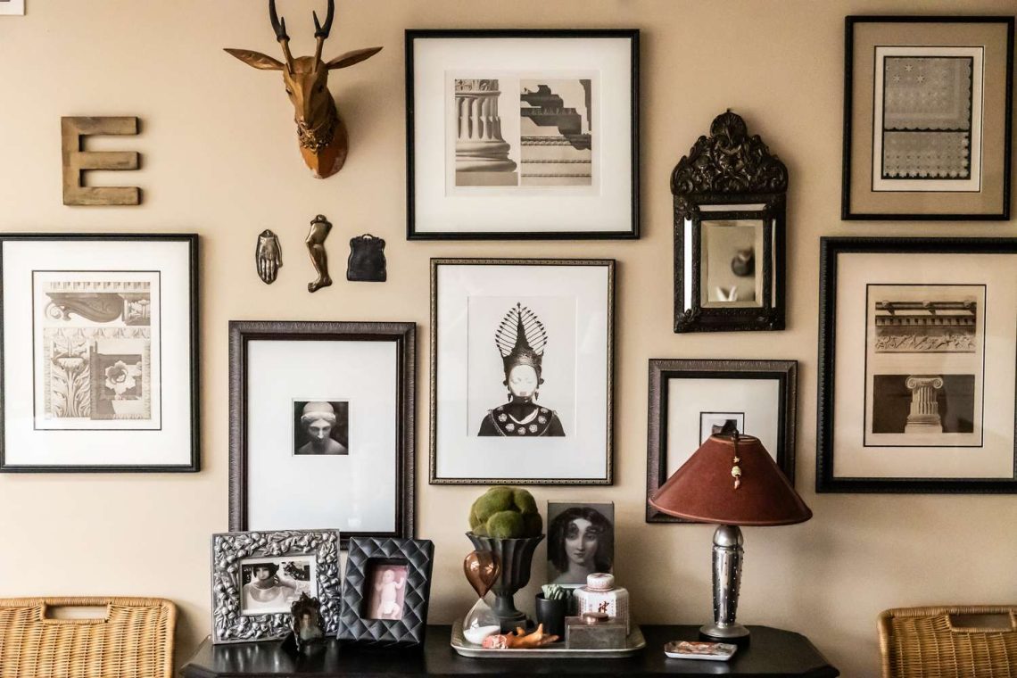
A gallery wall represents the ultimate expression of personal style in your home – it’s where you can tell your story through a carefully curated collection of photographs, art, and meaningful objects. Far more than a random assemblage of frames, a well-designed gallery wall serves as the visual centerpiece of a room, injecting personality and creating a unique focal point that draws the eye and sparks conversation. The process of creating a gallery wall can seem daunting, but with the right approach, anyone can achieve a professional-looking result. This comprehensive guide will take you through every step of the process, from initial curation to the final hanging, ensuring your gallery wall becomes a stunning and cohesive expression of your personal aesthetic.
Step 1: Curate Your Collection
The foundation of any successful gallery wall is a thoughtfully selected collection of items that work together harmoniously. This curation process is where you begin to define the story your wall will tell and establish the visual elements that will create cohesion.
Choosing a Theme:
Your gallery wall should have a unifying element that ties the pieces together. This doesn’t mean everything needs to match exactly, but there should be some connection. Consider these theme options:
- Family photographs in chronological order or organized by event
- Travel memories featuring a specific color palette
- Artwork by a single artist or from a particular period
- Black and white photographs that vary in subject but maintain visual consistency
- A collection of vintage prints with similar subject matter
- Mixed media combining photos, artwork, and small 3D objects
Pro Curation Tip: Gather at least 20-30% more items than you think you’ll need. This gives you flexibility during the arrangement process and allows you to replace pieces that don’t work as planned.
Developing a Consistent Color Palette:
Whether you’re working with photographs, artwork, or a mix of both, establishing a consistent color palette helps create visual harmony. Consider the colors in your room and choose pieces that either complement or thoughtfully contrast with your existing décor.
When working with photographs, even if they’re in different color schemes, look for images that share similar tones or moods. For example, all images might have warm lighting or cool shadows that create a cohesive visual flow.
Step 2: Frame It Right
Framing is where the magic happens – the right frames can elevate your collection from a random grouping to a cohesive design statement. Your framing approach can either create a unified, cohesive look or an eclectic, collected-over-time appearance, both of which can be successful when executed thoughtfully.
Approach 1: Cohesive Look with Identical Frames
Using the same frame style for all pieces creates a clean, museum-like appearance that lets the content of the artwork take center stage. This approach works particularly well with:
- Black and white photography
- Similar-sized pieces
- A minimalist or contemporary design aesthetic
- A collection that varies significantly in subject matter
Stick to simple, classic frames that won’t compete with the artwork. A thin black frame or simple wood frame in a natural finish tends to work well for most applications.
Approach 2: Eclectic Mix of Styles, Colors, and Textures
Combining different frame styles can create an interesting, collected-over-time appearance that suggests a curated, lived-in aesthetic. This approach works well with:
- Family photographs spanning different eras
- A mix of artwork from different periods
- A bohemian or eclectic design style
- A collection of vintage finds and personal treasures
Unifying Element: Even with different frames, maintain one unifying element such as a consistent mat color, similar frame width, or a shared finish color to keep the collection cohesive.
Framing Considerations:
Consider the weight of your frames, especially if you’re planning a large gallery wall. Heavy ornate frames can be beautiful but may require additional wall support. Also consider the matting – while not always necessary, mats can create visual breathing room between the art and frame, especially for pieces that vary in size.
Step 3: Plan Your Layout on the Floor
Before making any nail holes in your wall, the most foolproof method is to arrange all your frames on the floor first. This allows you to perfect the composition without the pressure of working with tools, and you can easily move pieces around until the arrangement feels right.
Floor Planning Technique: Start by grouping your frames by size, then work on the overall shape of your gallery wall. Is it going to be a rectangle, a more organic shape, or perhaps a long horizontal arrangement?
Composition Fundamentals:
Consider the visual weight of each piece – a large, dark piece carries more visual weight than a small, light piece. Balance these elements throughout your arrangement. Create focal points by placing your most impactful pieces (largest, most colorful, or most meaningful) strategically throughout.
Think about creating movement with your arrangement – guide the eye through the collection with a thoughtful flow. This might mean arranging pieces in a way that creates leading lines or balancing symmetrical elements with asymmetrical ones.
Proportion Tip: A gallery wall should ideally take up about 60-75% of the wall space above your furniture. Don’t make it too small or it will look lost, but don’t overwhelm the wall either.
Size Variation:
Include a range of sizes to create visual interest. A collection of all the same size can look static and boring. However, be careful not to include pieces that are so dramatically different in size that they compete with each other for attention.
Consider the 60-30-10 rule: 60% of your pieces should be medium-sized, 30% larger statement pieces, and 10% small accent pieces.
Step 4: Use Paper Templates
Once you’ve perfected your floor arrangement, the next step is to create paper templates of each frame. This allows you to visualize the final layout on the wall without the weight and risk of hanging actual frames repeatedly.
Creating Templates:
Using craft paper, newspaper, or even the back of wrapping paper, trace each frame and cut it out to exact size. Write on the back of each template which frame it represents and any rotation information (horizontal, vertical, or at an angle).
Label each template with a number that corresponds to a list where you note details about each piece – frame style, size, and what’s in the picture. This will help you remember how everything should hang.
Positioning Templates:
Tape the templates to the wall using painter’s tape, recreating the arrangement you perfected on the floor. Use a level to ensure your rows and columns are straight. This is also a good time to consider the spacing between frames.
Standard spacing is typically 2-3 inches between frames, though this can vary based on the size of your pieces and the overall look you’re trying to achieve. For a cozier feel, use 1.5-2 inches; for a more formal, museum feel, use 3-4 inches.
Lighting Consideration: As you position your templates, consider how the art will be lit. If possible, plan for some of your pieces to be in areas that receive natural light, but avoid direct sunlight that could fade artwork over time.
Step 5: Hanging Tips & Tricks
With your paper templates perfected, it’s time for the actual hanging. This is where patience and precision pay off, as you’ll be following the roadmap you’ve created to achieve a professional-looking result.
Proper Spacing Guidelines:
Maintain consistent spacing between frames – 2-3 inches is standard, but the most important thing is that the spacing feels visually consistent. If your frames are different sizes, you might need to adjust actual measurements while maintaining visual harmony.
Use a level frequently to ensure your frames are straight. Even a slightly crooked frame can be very noticeable in a gallery wall setting. Consider using a laser level for large arrangements to ensure everything stays perfectly aligned.
Hanging Hardware: Use appropriate hanging hardware for the weight of your frames. Canvas pieces and heavy frames need stronger hooks than lightweight photo frames. When in doubt, use hardware rated for more weight than your heaviest frames.
Centering Your Collection:
Center your gallery wall on a focal point in the room, typically the piece of furniture below it (like a sofa or console table) rather than the entire wall. This creates better visual balance.
Hang your gallery wall at eye level, which is typically about 57-60 inches from the floor to the center of your arrangement. This might mean the top of your wall grouping is higher than you initially expected.
Wall Conditions: Check the wall construction before hanging. Drywall requires different anchors than plaster or solid wall construction. For heavy collections, try to hit wall studs when possible.
Advanced Gallery Wall Techniques
Once you’ve mastered the basics, consider these advanced techniques to take your gallery wall to the next level and create even more sophisticated arrangements.
Creating Visual Tension:
Play with asymmetry to create visual interest. A perfectly symmetrical arrangement can feel static, while a carefully planned asymmetrical one can create energy and movement. The key is ensuring that the visual weight remains balanced even if the physical arrangement isn’t.
Consider overlapping frames in some areas – this works particularly well with smaller pieces and can add depth to your arrangement. Just ensure that the overlapping elements are thoughtfully planned and don’t obscure important details in your artwork.
Integrating 3D Elements:
Don’t limit yourself to just flat frames. Consider integrating small 3D elements like a piece of driftwood, a small sculpture, or even a decorative box. These elements add texture and depth to your gallery wall.
When adding 3D elements, treat them as you would a frame – consider their size, color, and position in the overall composition. They should enhance the gallery, not compete with the art.
Seasonal Adaptations:
Consider making your gallery wall partially changeable to accommodate seasonal decor or new additions to your collection. This might mean reserving some spots for rotating pieces or using easily changeable display methods.
Troubleshooting Common Gallery Wall Problems
Even with careful planning, you might encounter challenges during installation. Understanding common problems and their solutions will help you achieve your desired result.
Problem: Frames Don’t Align Properly
Solution: Check that you’re using consistent hanging points. Frames should hang from the same point (usually the wire or D-ring) rather than from different heights. Use a level frequently and consider using a laser level for large installations.
Problem: Gallery Wall Looks Chopped Up
Solution: This often happens when spacing is inconsistent or when you have too many small frames that don’t connect visually. Consider grouping smaller pieces in clusters of 2-3, or increasing the size of some pieces to create better visual flow.
Reassessment Technique:
Step back frequently during installation – sometimes 10 feet away from the wall – to see how the arrangement looks as a whole. What looks good up close might not work from a distance where the wall will actually be viewed.
Problem: Collection Feels Unbalanced
Solution: Distribute visual weight throughout the arrangement. If you have a large dark piece on one side, balance it with a cluster of medium pieces on the other side, or a large light piece. Consider the overall shape of your arrangement and ensure it’s visually stable.
Maintaining and Evolving Your Gallery Wall
Your gallery wall isn’t a static element – it can evolve over time as your collection grows and your tastes change. Planning for this evolution from the beginning will make future modifications easier.
Future-Proofing Your Design:
Leave some space in your initial design for future additions. This doesn’t mean leaving large gaps, but rather planning the arrangement so that new pieces can be integrated without disrupting the entire composition.
Consider the overall shape of your gallery wall and how it might expand. For example, if you start with a horizontal arrangement, consider how you might expand vertically while maintaining balance.
Documentation: Take a photo of your completed gallery wall and keep a record of the hanging hardware used for each frame. This will be invaluable if you ever need to remove and reinstall the wall.
Seasonal Care and Updates:
Periodically clean your frames and artwork to keep your gallery wall looking fresh. Use appropriate cleaning methods for different types of artwork – avoid harsh chemicals that might damage photographs or artwork.
Consider rotating some pieces seasonally to add new interest to the space. This is particularly effective with photography, where seasonal images can create a dynamic, changing element in your home.
Conclusion
Creating a professional-looking gallery wall is all about planning, patience, and understanding the principles of visual balance. The floor planning method, combined with paper templates, virtually guarantees a successful result that you’ll be proud to show off.
Remember that a gallery wall is a personal expression of your style and experiences. Don’t be afraid to experiment with different arrangements and elements. The goal is to create a space that feels uniquely yours while maintaining visual harmony.
Whether you opt for a cohesive, museum-quality look with matching frames or a more eclectic, collected-over-time aesthetic, the key is to approach the process thoughtfully. Take your time with the planning stages, and don’t rush the installation process.
Most importantly, have fun with the process. Creating a gallery wall is an opportunity to curate a collection of images and objects that bring you joy every time you see them. With these techniques and a little patience, you’ll create a stunning focal point that enhances your home and reflects your personal style.